A movie poster usually determines whether or not I am going to watch the trailer or even go to the cinema. A website design is usually a crucial factor in making the decision whether a visitor is going to look through headlines and stay for some time to read the article or review the products or services. A movie poster is usually meant to:
- call to action – i.e. encourage to watch a movie;
- set expectations = find its targeted audience (e.g. people who prefer comedies to horror movies);
- establish the brand – i.e. make a movie name recognizable;
- start the buzz (e.g. “Have you seen that movie poster?“);
All in all, just the same what we want a website design to do. By studying the techniques behind creating a movie poster, we can learn some essential web design principles:
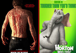
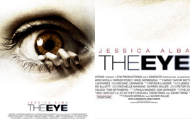
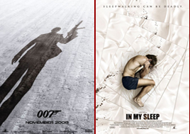
1. Don’t underestimate the power of colors. Dark neutral hues usually mean that’s a horror movie or thriller while bright colors always set expectations of an amusing comedy (same goes about a website design – color choice may determine what a visitor will first think about, his feelings and actions):
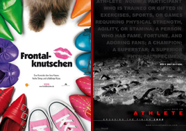
2. Focus on your product most powerful side = e.g. if there is a celebrity starring in a movie, its poster usually gives his/her image prominence. (Choose what you are going to focus on: brand your name or your image. Don’t try to do both – or you will frustrate your visitor):
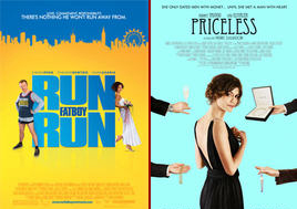
3. Create and implement a catchy relevant slogan. Make sure it reveals your website content, catches attention and sticks in the memory:
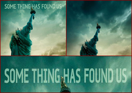
4. Even fonts matter. Have you ever noticed that a fantasy film poster is usually distinguished by specific (usually orange or red) ancient-looking cursive fonts while psychological thrillers are usually depicted with the help of plain non-ornamented proportionately-spaced fonts? (Fonts should reflect the overall website style and content)
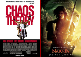
5. Add images that clearly describe what your website is about – a vivid image is what a person will associate with a movie. (Like we already know, images are not the first thing a visitor sees when entering a website; but that’s imaginary that can get a visitor interested and foster sticky associations)
6. Sometimes minimum of elements that makes your site stand out – don’t add to many elements; focus on what is really important.
7. Set expectations. Make sure your visitor will instantly understand what your website is about. Everything matters: the words, the colors, the fonts, the imaginary, the prominence of some elements, even the gestures of the characters: