Colorize Your Brand – How Color Builds Your Brand

Most bloggers [me being one of them] don’t have a clue what their website color scheme might be associated with. For me it has been enough that I “like” the overall site look. But as an online entrepreneur and consultant I felt that I needed to know at least the theoretical part [maybe I will come up with some testing in the future]. So being happy to enjoy a few days of free time during the holidays I did some research and got so excited with it that decided to share it here at my blog.
Color is a crucial element of a brand identity. I immediately associate skype with blue color StumbleUpon with green, Yahoo with red (due to its red Y letter in my FF search engine list). Website color scheme can make me to leave immediately or to stay for a minute if it looks appealing. Color evokes positive associations and thus forms my initial opinion of the brand. The choice of your brand color can thus stand for:
- your new visitors’ enrollment and participation (by attracting their attention);
- your brand awareness (by sticking into memory);
- your brand positive or negative associations (by boosting memories of what people like/dislike).
General “Color in Business” Theory:
| GROUP | COLOR | ASSOCIATIONS | NATURE OF ASSOCIATIONS | RECOMMENDED FOR |
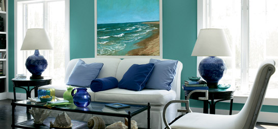
| cool (calming) | Blue | secure and trustworthy | sky (therefore universally liked) | business related websites (e.g. banks) |
| Green | wealth (deep green) | money (“the color of success”) | finance related websites (e.g. Forex related) | |
| calming (light green) | trees, spring | entertainment and leisure related websites | ||
| warm (exciting) | Red | grabs attention and makes you energatic (by activating your pituitary gland) |
power (e.g. red carpet) | eye-catching logos, calls to action |
| Yellow | optimism | sun | attention grabbing (esp. using it in contrast with other color) |
|
| Pink | energy (hot pink) | feminine color | products for young women | |
| romantic (lighter pink) | products for girls | |||
| Orange | cheerful | citrus fruit | kids’ websites | |
| neutral | Black | powerful | “absence of color” | expensive products |
| White | simplicity and purity (catches the eye) | numerous (from brides to hospitals) | health related products |
[based on an article on brand colors and awesome Sensational Color blog]
Facts we should also know about colors:
- Color is a powerful promotional tool;
- Colors should be trendy and catchy (use “colors that pop”);
- Between 60% and 90% of website initial assessment is based on its color.
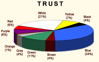
Here is also the graphical representation of how different colors are associated with trust:

Personal Approach to a Brand Color:
To me color perception is very individual. My favorite color is blue (more often that’s light blue but as a rule I like any variation). Whenever I see a blue thingy, I am going to like it. I don’t really think that’s the matter of “trust” or “security” associations. It’s rather the integral part of my personality. While I was searching for “color meanings” and “brand colors” I came across this pretty little color quiz, and I really liked what I got there:
You might also want to try this quiz and post here if what you got really matched your personality.
Modern Approach to Brand Colors:
Internet has got much brighter recently [have you also noticed that?]. There is no boring fixed color limitations (pink is not only for online women’s magazines and if you are running an online marketing blog, it is not a must that you should choose a dull dark scheme). With numerous funny “colorish” blog templates you browse daily, your eye is accustomed to bright colors and spotting a black and white design or a white-background template is somehow an unusual thing [ probably it can catch a visitor's eye even more effectively than a colorful website - that is merely my assumption, I have not found any research supporting it].
Web 2.0 (online video, photo sharing, social networks, etc) and blogging changed the overall web color scheme dramatically. Colorful logos and buttons have become a new internet fashion trend – sometimes the eye even gets tired, I would say.
What is the color of social networks?
Blue?
Red?
Maybe the palette of all known colors!
Bottom-Line
I still don’t think choosing a brand color according to the theoretical approach described at the beginning of the article is the wisest thing to do (though it is worth testing). What is more important is to be consistent and original in colorizing your brand. People will remember your website at first glance if you put a little thought and effort in designing your website. What should be taken into consideration while choosing your brand color, you should remember:
- Color can get people interested in your website;
- Color will make people remember your website;
- Brand color can be a niche marketing tool the way a movie poster finds the movie audience:

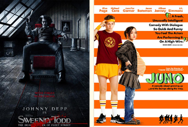
Which of these two movies would you prefer to see?
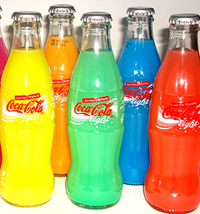
P.S. Thanks to Funkyah for a nice post image.
Related posts:


50 Responses to “Colorize Your Brand – How Color Builds Your Brand”
Blue… and shades of light blue work for me.
By geri on Jan 3, 2008
Annie, pass this one on to Susan (Brandcurve). I’m sure she’ll love it!
By Gab "SEO ROI" Goldenberg on Jan 3, 2008
First time that I have been to your website… It is pretty nice, I will definitely have to come back sometime.
By Matt Longley on Jan 4, 2008
Hi,
Your site is one of my favorites seen around blog explosion. Keep up the good work.
I enjoy reading your blog. It is great to find someone who can find the fun things in life!
I wish you all the best in all years.
Please take a look at my websites and increase your page rank, traffic as well. I look forward to developing a friendship and networking with you. Let me know if there is something I can do to assist you with your business.
With Regards,
Karoly Domonyi
http://www.Aries.hu
http://www.ariestrade.com
http://www.AddProductFree.com
http://www.AddWebSiteFree.com
By Karoly Domonyi on Jan 5, 2008
You’ve certainly done your research here! If you want more in depth information about color, check out the International Association of Color Consultants website http://iaccna.org
They have a fantastic accreditation program – you can take your color knowledge to a completely different level. It’s absolutely fascinating stuff, isn’t it?
By Rachel on Jan 8, 2008
Coloring is Very important.
By Maldiveslive on Jan 12, 2008
that is really cool thanx for sharing such information I love to do it
By jasmine on Jan 17, 2008
I always knew I was the playful type, but the orange, gray and white we use was more of an artistic statement.
Nice post Ann, your name fits you well…
By Seo Design Solutions on Jan 19, 2008
You’re right about the colors, I put this webpage on my links toolbar, but for some odd reason I kept clicking on it, maybe because the icon is red.
By Tim on Jan 22, 2008
@Tim: Thanks God it worked!
Honestly seosmarty favicon was created by myself and from my point of view looks really amateur but I am happy to hear it really works!
@everyone: Thanks for your comments!
By Ann Smarty on Jan 23, 2008
I use mostly blue on my website with a red/blue mix on my logo. Then for ads I use red. It’s worked for me so far. I always get comments on how calm and busines-like my website is. Now I just need to fix my blog css and maybe get a new header. heh.
By SEO Rob on Jan 29, 2008
Red, grey and white work for me.
It works well with women too…
By Ohio Realtor on Jan 29, 2008
Hi Ann,
I took the color quiz. Funny thing about the result (Sun Kissed). It contains the basic colors of your site (red, black, light yellow) — inviting colors. Is that the reason why you used the colors on your site?
Still learning more about colors and other stuff. I sort of like the logo on my site, now I’m at a loss as to how a can put more of my personality to it.
Wish you can put a “track comments feature” so that people can track the responses to comments.
By TxTu on Feb 5, 2008
@ TxTu: Hmmm… a good question! I’ve been thinking about that but couldn’t find time to actually do that. You’ve encouraged me to get down to installing the feature!
As for my blog color, well, like I said, there wasn’t much thinking behind coloring the overall theme, but I did pay attention to header and elements…
My advice to you as per your logo and website… Your logo is great, I wouldn’t change it, but your overall site scheme seems too colorful (it might be attention distracting, you know). I would try to make it a bit more balanced. And try to do a bit of testing to find the best solution…
By Ann Smarty on Feb 6, 2008
I don’t know what your point is with that ending note. I would obviously rather see Sweeney Todd, which I think is the opposite of the point you’re trying to make, therefore invalidating it.
By Josh on Feb 14, 2008
This is great! I’ve always known that Color effects the way people view things but to have it broken down like this is great.
We are just redoing our site and I’ll make sure everyone checks this blog out. Thank you!
Richard
http://www.FilmIndustryBloggers.com
By Richard Janes on Feb 14, 2008
Interesting post, you might be interested in this article:
http://neilperkin.typepad.com/only_dead_fish/2007/06/the-language-of.html
The lady seems to suggest that colour is culturally defined. So if you were making a site for a Chinese client you would need a different colour scheme than if you made on for an American client
By Chris on Feb 16, 2008
I use mostly blue on my website with a red/blue mix on my logo. Then for ads I use red. It’s worked for me so far. I always get comments on how calm and busines-like my website is.
By mehmet on Mar 14, 2008
Culturally, colours carry different significances. Associations with colour aren’t inbuilt or genetic, and so it’d be wrong to assume that these colour associations would work in the same way for all cultures.
By DMC on Oct 31, 2008
great post. i use light blue on my site for the very same reason. it brings out the trust in my content.
By disneyland discounts on Feb 19, 2009
Well i feel it differs with the work/business you are in to.In case of restaurants use red table cloths and accessories so that people dont spent longer time. While using light shades of blue green and even white too, which makes customers sit for long, In turn reducing the sales.
By UK Business Center on Mar 11, 2009
the theories about colour represented here are way too blunt. a blue can be warm, cold, trustworthy, bold, modern, traditional, scary or nice depending on hue. never trust colour theory that include lesser colours than the human eye can tell apart.
By annanym on Jul 17, 2009
Awesome article, thanks! stumbled…
By Robert on Oct 7, 2009
Not sure if you’ve seen this, but you might find it interesting:
http://www.guardian.co.uk/world/2006/oct/11/usa.danglaister
Jail cells painted pink to stop repeat offenders. BTW: Excellent article and definitely worth the read/bookmark. Thanks for putting this together!
By Zoo Coupons on Jan 5, 2010