
 More often than not, it is not enough for you that your visitors just come and go. You want them to do something at your site. Unfortunately usually webmasters pay too little attention to their calls-to-action focusing on design, content and SEO. It is sad to see truly good resources that are doing great in SERPs but fail to engage their visitors.
Calls to action may vary. You may want your visitors to subscribe, to register, to buy something, to bookmark your post, etc. With calls to action everything is important: the color of your buttons and supporting elements, the language you use to describe the action, the place on the page where you locate them, the additional elements that encourage people to act. All these elements should be consistent and support each other getting your visitors one step closer to their objective.
The Color Of Call-To-Action
| COLOR | NATURE OF ASSOCIATIONS | WHERE TO USE | DRAWBACKS |
| Red | increases your heart rate by activating your pituitary gland | a classic call to action color | might be associated with debt and danger |
| Yellow | the first color a person sees | draw attention to your call-to-action | |
| Orange | combination of aggressive red and cheerful yellow | perfect call-to-action | |
| Blue | may make your visitor reconsider the action | ||
| Green | the easiest for the eyes | good for testimonials, founder’s story, etc | |
| White | gives other colors prominence | make your call-to-action stand out |
Based on “Which Color is the Right Color?” (The source link was deleted)
The Words For Call-To-Action
1) Your call-to-action should make it clear what the site is about.
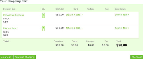
I was browsing some non-profit organizations the other day and came up to a good example of how to use inappropriate vocabulary when talking about donating. Here is a nice site asking for donations to “make the world better”: if you want to donate money for a good cause, you need to (1) add your donation to cart, (2) view your shopping cart and (3) checkout. Do you still feel you want to make a donation? Me not. With words like these donation (that is supposed to make me feel happy for “making the world better”) gives me the feeling I am buying a bar of chocolate.
2) It may also be wise to scatter several calls to action throughout the site making the most of synonyms and encouraging words to:
- Explain how to make an action (e.g. “Click here to buy”);
- Use ‘softer’ calls-to-action (e.g. “try it” instead of “buy it”);
- Imply immediacy of the action (e.g. “Buy now“).
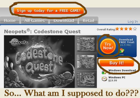
! Important note: Using several calls to action is OK unless this tactic promotes FUD (i.e. fear, uncertainty and doubt) or distracts attention:
Where To Call To Action?
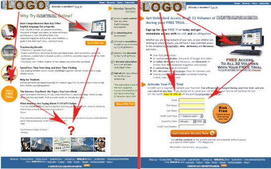
A great research by Marketing Experiments showcasing the landing page optimization suggests placing a call to action along the customer’s eye path (that you build by your design elements) through the page. Look here:
A Few Examples?
Two helpful links that can demonstrate the theory summed up above: call-to-action button collection and add to cart button collection (each linking to a merchant’s site); so see for yourself! (I personally find most of them painfully poor examples of calls to action.)