
A few days ago I tested this blog homepage with one handy tool I recommend trying: Five Second Test. That was both fun and useful. Now what I did:
- got a screenshot of the blog home page;
- filled in the form;
- uploaded the screenshot there;
- posted the generated link at Twitter and asked my dear followers to take part in the experiment.
The participants were offered to look at the picture for 5 seconds and list max. 5 things they remembered.
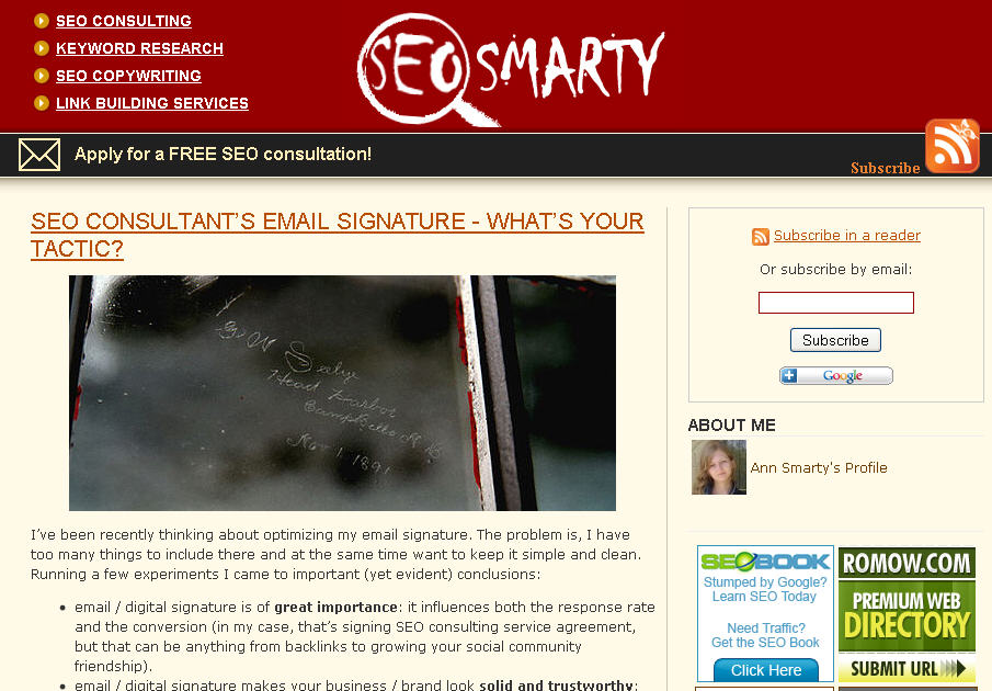
Here is the screenshot I posted (click for the full-sized version):
Now the results (that were fun): 25 Twitteres took part in the test.
Most often mentioned page elements:
- Top post title (mentioned 10 times);
- Color – “red” (mentioned 10 times); examples:
- red head;
- red & white color scheme;
- red letters, etc.
- Â Top post image (mentioned 9 times):
- cursive writing;
- frosted glass;
- window with signature, etc.
- SEO smarty (mentioned 8 times);
- SEO consulting (mentioned 7 times);
- My photo (mentioned 7 times):
- your portrait;
- Ann Smarty’s face;
- author’s photo, etc
- RSS (mentioned 6 times).
The funniest result:
1: Red in top
2: SEO Consultants Signature – Whats your tactic
3: Damn…
Conclusions:
- SEO association ended up the most popular after all (together with SEO smarty and SEO consulting it was mentioned 20 times);
- I do realize the test was taken by people who knew me (as they are my Twitter followers) and most probably had already seen my blog before the test.
- The test is a good way to look at your own site “from outside”; so try it!
P.S. Guess what the trick with the post image is! 😉
Post image: Infinite Usability Loop!
The following two tabs change content below.


I am Ann Smarty, owner of SEOsmarty.com and co-founder of Smarty.Marketing. I've been in the SEO industry for two decades and I am now reporting on search and AI news over at annsmarty.com