More often than not, it is not enough for you that your visitors just come and go. You want them to do something at your site. Unfortunately usually webmasters pay too little attention to their calls-to-action focusing on design, content and SEO. It is sad to see truly good resources that are doing great in SERPs but fail to engage their visitors.
Calls to action may vary. You may want your visitors to subscribe, to register, to buy something, to bookmark your post, etc. With calls to action everything is important: the color of your buttons and supporting elements, the language you use to describe the action, the place on the page where you locate them, the additional elements that encourage people to act. All these elements should be consistent and support each other getting your visitors one step closer to their objective.
The Color Of Call-To-Action
COLOR | NATURE OF ASSOCIATIONS | WHERE TO USE | DRAWBACKS |
Red | increases your heart rate by activating your pituitary gland | a classic call to action color | might be associated with debt and danger |
Yellow | the first color a person sees | draw attention to your call-to-action | |
Orange | combination of aggressive red and cheerful yellow | perfect call-to-action | |
Blue | may make your visitor reconsider the action | ||
Green | the easiest for the eyes | good for testimonials, founder’s story, etc | |
White | gives other colors prominence | make your call-to-action stand out |
Based on “Which Color is the Right Color?” (The source link was deleted)
The Words For Call-To-Action
1) Your call-to-action should make it clear what the site is about.
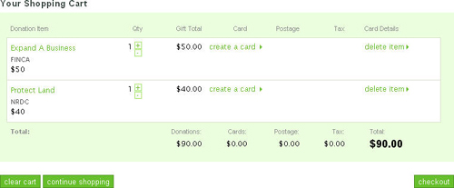
I was browsing some non-profit organizations the other day and came up to a good example of how to use inappropriate vocabulary when talking about donating. Here is a nice site asking for donations to “make the world better”: if you want to donate money for a good cause, you need to (1) add your donation to cart, (2) view your shopping cart and (3) checkout. Do you still feel you want to make a donation? Me not. With words like these donation (that is supposed to make me feel happy for “making the world better”) gives me the feeling I am buying a bar of chocolate.
2) It may also be wise to scatter several calls to action throughout the site making the most of synonyms and encouraging words to:
- Explain how to make an action (e.g. “Click here to buy”);
- Use ‘softer’ calls-to-action (e.g. “try it” instead of “buy it”);
- Imply immediacy of the action (e.g. “Buy now“).
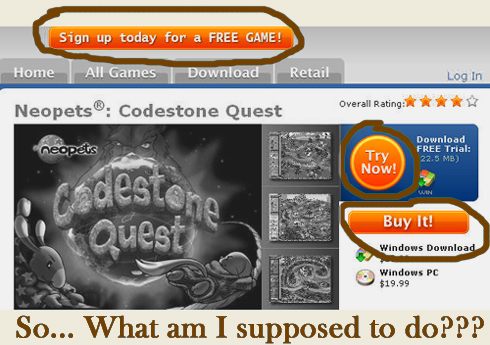
! Important note: Using several calls to action is OK unless this tactic promotes FUD (i.e. fear, uncertainty and doubt) or distracts attention:
Where To Call To Action?
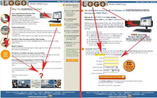
A great research by Marketing Experiments showcasing the landing page optimization suggests placing a call to action along the customer’s eye path (that you build by your design elements) through the page. Look here:
A Few Examples?
Two helpful links that can demonstrate the theory summed up above: call-to-action button collection and add to cart button collection (each linking to a merchant’s site); so see for yourself! (I personally find most of them painfully poor examples of calls to action.)
Latest posts by Ann Smarty (see all)
- Semantic Research + AI = Win - May 15, 2023
- Visual Quotes. HOW TO: Quote Using Text-to-Image Tools (and Go Viral) - Aug 9, 2022
- Digital Marketing Tools: Best New SEO Software I Use - Apr 5, 2022
Love your example of the color of call to action. That is very helpful.
Great post Ann, sphunn and tagged at delicious for future reference. My latest call to action in my sidebar is Yellow, will be interesting to see how it works (red just wouldn’t work with my colour scheme)
Great reference material Ann, the more I read the more It reinforces my admiration of your no-nonsense this is what works (no drama) SEO style. Priceless…
(copy paste from Sphinn)
I got alot out of this Ann thank you.
It’s interesting to see the different angles that can be taken in reference to color relating to call-to-action.
(“Great post!”) wink
PS-For the books: I was your official Hot Sphinn. (#22)
I’ve been trying to read up on improving my site. Thank you for the very informative article especially the way you use a table to in presenting the way colors affect a site. Would definitely try to apply them on my site.
Ann, how the hell did you acquire so much knowledge so fast? Nice pics at the end especially, regarding using calls-to-action where the eye is drawn naturally. Smart idea, and I’m going to be integrating that asap :).
Hi Ann. This is EXACTLY what I was looking for. I wanted to know what colors are associated to certain actions. Thanks for the short but concise read (my favorite type of writing…big plus when @ work as you can imagine :D).
Thanks for your helpful post. To find the optimal place for calls-to-action you can use heat maps as well. They show the most eye-catching sections on the page by marking them in red, orange and yellow – actually, these are popular colors while talking about call-to-action 🙂
@ Kristen: Thanks, I hope it helps.
@ Glen: I just sent you an email, please let me know your thoughts.
@ SEO Design Solutions: Thank you for the compliments 🙂
@ spostareduro: My official Hot Sphinn? Thank you, dear, nicely done 😉
@ TxTu: if you do, please share your experience;
@ Gab: Lol… I am planning to write a post at Youmoz sharing my experience of doing a research.
@ Giun Sun: Yes, I try to keep it short and informative. I am glad you like it.
@ http://www.copywriting911.com: That is actually a great point! I will have to look into it!
Finally, a call-to-action post that integrates color choice! I’ve seen studies that say “green button converts x% better than orange” for example. This color chart should be considered from branding-day-one! Nice post Ann!
Um, does this mean that I’m screwed because my blog template uses a lot of blue…?
Then again, it’s not an e-commerce site, it’s a blog…
@ Linda: Thank you 🙂 I’ll try to find more info on colors.
@ Mark: Nope that doesn’t mean you’re screwed. Actually this post is about calls to action, not overall site theme. Your call-to-acton (feed button) is orange. You might want read about colors in general in my previous post: blue is believed to be the color of trust 🙂
What a great post Ann! I have been doing a lot of on-page conversion optimization lately without much luck, so this is extremely helpful!
what do you thinking about using these colors while still maintaining a site/company color scheme?
Recently i’ve been working on conversions for one page on our site in particular. I want to make the CTA button very obvious but I can’t use any loud colors because it throws off the scheme.
Nice post, Ann.
Like you say, it’s sad to see how many get this one wrong, as this is the single most important thing for good conversion of your website.
A good contrast is important which is why white might work very well on a bright red website but not on a white one.
Look forward to see your YOUmoz post on your research 🙂
@ Calamier: Thanks 🙂 My advice is to use calls-to-action that fit the color scheme. If your call to action is not consistent with the overall site look, it can make visitors feel insecure. The best way is to keep everything in harmony. Try experimenting with different color shades and I am sure you will find the golden middle.
Hmmmm…. Great post and damn you.
I actually have a draft post for SEOmoz that is very similar, but not identical, to the topic of this post.
But it looks like you stole my thunder.
I’ll have to go back over my draft again to make sure I don’t pollute the blogosphere with any redundancy.
Oh and BTW – speaking of calls to action – if you’re going to keep writing great posts like you have been – you’re going to need to put one of those blue sphinn badgy things on your blog posts.
That will make it much easier for all of us.
@ Vinny: Lol… I am sure your post is going to offer a completely new perspective – so I beg you to post it at YOUMoz…
And oh, yes, I will be optimizing for Sphinn today (or tomorrow) – I do suffer from lack of free time 🙁
This is probably the best analysis I’ve seen for creating an effective call to action on a website. I submitted it to bizSugar.
Hi Ann,
Good job making Call to Action improvements easy to understand, and glad you liked our research brief. We appreciate you citing it.
Here’s another research brief on improving Calls to Action that your readers might be interested in: “Landing Page Optimization: Increasing Conversion by 150% and Lead Gen by 2,379% with an Effective Call-to-Action.”
It’s in our free research archive at http://www.marketingexperiments.com/improving-website-conversion/increasing-conversion.html
Your readers might also be interested in attending our next live Webinar, where our team will give landing page optimization recommendations for pages submitted by our subscribers. This is part 2 of the free Clinic we gave this past Wednesday. The web clinics are always free.
Cheers,
Peg Davis
Writer
marketingexperiments.com
Really impressive, I loved the examples you used.
Do you have any data on how other means of ‘closing’ can be used? Like an assumptive close once you lead them on a sales path for a certain amount of time?
Just found your blog and have read most of your posts, great insight and easy to read – keep it up.
@John Holsen: Thanks, John! Highly appreciated.
@Peg Davis: Thank you for stopping by and for the link. I will definitely join one of your upcoming webinars.
@Mike Tighe: a very good question! I will have to explore it and post a follow up here.
nice post!
Fascinating color work. One of the more effective opt-in pages has
1. A red outline,
2. A yellow box with
3. Orange background opt-in forms.
Cute, huh?
There was another study, which I forget right now (it was pre-Internet) where pink fliers were most effective for new clients, and yellow was better when they had already taken one service and needed to move up (the funnel). Green was for donations…
@Robert: If you find the link, drop me a line – I am still exploring the topic.
Hi ,
We’ve just created a list of “Checkout Buttons” 🙂 I hope you’ll find it interesting.
You can see the list on the Checkout Buttons page, as long with some interesting statistics about them.
Cheers,
Traian
Hi Ann,
Really great information you provide us in such a simple words. We all are really thankful for the article.
Wow!!! Good job. Could I take some of yours triks to build my own site?
Thanks so very much for taking your time to create this very useful and informative site. I have learned a lot from your site. Thanks!!
I like it and the background and colors make it easy to read
I like the idea follow the customer’s eye path. Clear, direct, and no hesitation.
on ars technica there is this article about color perception.
Another happy subscriber here 🙂 Great Job Ann!
I came here looking for best practices related to putting up phone numbers on the site and get the phones ringing. What are your thoughts about placement, text, colors and icons that get the job done?
@OSHA Training, hey there! Good question. There is not much I have researched there but I definitely should and will…
Thanks for the great tips, I am testing out different colors for our call to action buttons. We have had the best response with green actually.
Nice post Ann, I love the colour analysis, I’ve picked red as it’s bold and it works well with my other colours, orange was a little too subtle unfortunately!
These are great call to actions…does anyone have any other resources with good info like this?
Ann, this is really helpful. We found that adding a few of your suggestions made a difference. Do you know where we might find some statistics (ie; % increase/decrease) for the conversion difference between colours for a call to action?
@FinanceAcar, I am not aware of such stats, so I’ll have to search
Wow! Just the post i need to show to clients when they think they know what is best in their website design. This will save me a lot of grief.
Great information. Thanks for posting this.
Ann, this is really helpful. We found that adding a few of your suggestions made a difference. Do you know where we might find some statistics (ie; % increase/decrease) for the conversion difference between colours for a call to action?
One of the first sites I made was also one of the most successful, as I had a very clear idea of what I wanted visitors to do when they came to my website. This made the call so simple and most of the content was geared around this concept. Over time, I still use this site as my litmus test when I am not getting the results I want from new projects. So my time, planning, etc. When at the end of the day, it is a moot point if you don’t explicitly tell your audience what to do next.
One of the primary sites I created was conjointly one among the foremost successful, as I had a really clear plan of what I wished guests to try to to after they came to my web site. This created the decision therefore straightforward and most of the content was geared around this idea. Over time, I still use this web site as my litmus take a look at once I am not obtaining the results i need from new comes. So my time, planning, etc. When at the tip of the day, it’s a moot purpose if you don’t explicitly tell your audience what to try to to next.
this can be extremely useful. we have a tendency to found that adding many of your suggestions created a distinction. does one understand where we’d realize some statistics (ie; p.c increase/decrease) for the conversion distinction between colors for a decision to action?
I am constantly studying on how to get people to pull the trigger, and place an on order on a landing page. Thanks for laying everything out in an understandable publication.
For a website that offers a service to others, how would the call to action for a site selling a product vs a site selling a service differ? I mean, i wouldnt force my visitors to sign up and sign the contract on site.
Great post, it’s amazing how many companies I’ve worked with totally miss the opportunity to tell their visitors what to do.
great tips…thank you for taking time for sharing it!!!
There has been a seminar where the importance of eye path was discussed. The idea is to guide the reader in a way that it ultimately makes a logical sense for him to buy. And more importantly, not lose him/her along the way.