
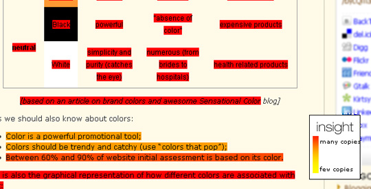
 What determines the usefulness of some of your content (as compared to the rest of your articles you write)? The number of people who found it valuable enough to link to it? The number of people who found it great enough to Tweet it or vote on social media? The number of people who re-blogged it? There are plenty of criteria and it is a wise idea to evaluate your content against various combinations of the criteria. Another wise idea is to try to realize which part of one particular article accounted for its popularity and apparent “usefulness”. And here’s a great way to do that: see which part of your article is copied more than the other parts and thus get a clear understanding of what exactly appealed to your readers. In other words, create a copy heat map of you posts. Why can a copy heatmap be used to define the content quality? This is obvious, I guess: if you copy something on the page, you either want to share it or save for the future reference. In either case, you have found the content useful enough to share or save. Thus, by taking a look at what people copy from your pages, you can define what appeals most to them and how to create more content like that. Is there any tool that can help you create a copy heat map of your pages? If there were no such a tool, I wouldn’t write the post! Tracer, the tool that can be mainly used to protect your content and get links from content thieves, has another cool feature: the heat map of your content based on the number of times it was copied. Some examples? One of my most successful posts on color branding, has been copied multiple times. According to Tracer, the post most useful parts are:
- The table representing the color in business theory;
- The facts about colors listed below the table:
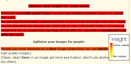
My other high-traffic post on optimizing images for search and social media appeals to the readers especially due to that part about making the images social-media-friendly:
What other heat mapping tools do we know? We’ve already seen a few tools that help you create heat maps:
- CrazyEgg shows which elements of your page gets clicked more often;
- Feng-Gui shows you the heat map of any image you submit based on the colors, orientation, contrast, intensity, element size, etc.
While these tools are definitely worth a try for various purposes; they can hardly be used to determine the quality of your actual content. So what are your thoughts? Do you use any of the listed heat mapping tools and if yes, then how exactly? Post image by steve phillips